11/11/2010

Brief Extension 3 - Event Merchandise Ideas and Development


The third and final Brief Extension for 'The Big Brownie Bake Off' was to create an additional piece that would sit well within our already accomplished event collection (hand rendered poster, digital poster and ticket design). I decided to do designs for aprons that could be worn during the event and bought by attendants after the event, brownie boxes and large and medium brownie bags, all fully branded. I wanted to really solidify a definite brand for the event in the form of merchandise that was both practical as well as aesthetically intriguing for the guests. Cost and sustainability with relation to environmentally friendly responsible design were top of my list when thinking about these concepts and so I resolved to design the aprons with screen printing in mind and the bags and boxes with recycled materials that can be used cheaply and without any fuss. As you can see I used a variety of ideas and combinations of the imagery and typography already explored earlier in the project to try to complete the collection. My final decision after evaluating my designs will be posted soon. No muss, no fuss.

Brief Extension 2 - Ticket Design - Ideas and Development


For the second extension of the brief we were to design tickets for our chosen event. These were to be of a similar concept to our posters to create a sense of brand continuity and recognition from our target audience. As my designs above show I looked at two completely different ways of representing the event in ticket form and the different ways I looked at of laying them out using elements from work I had already completed for the event. What I really wanted to maintain was a sense of vintage kitch I had explored in my research previously and also a strong connection to my original poster concept. This, I decided after doing some on screen development work, was best represented in the old style cinema ticket concept seen in many different ways above. The cupcake shape concept was really fun but with regards to practical industry production would have been very expensive to mass produce. However, I felt that just the simple 'cinema' ticket design was not enough and felt that the event was very likely to want to give its attendees something a little bit different so I created the apron shape you see at the top of this post. This idea could also be used to house not only the tickets purchased but also an information booklet on the event, but more importantly could be a precious keepsake for the attendees of the event which is something I feel the 'client' could be really open to (obviously depending on the cost!) This idea is shown here in its early stages of development but I feel it could be a real possibility in the body of work I am producing.

Brief Extension 1 - Digital Poster


The first extension of the event designs brief was to create a digital version of our poster designs. This was to be done in any manner we saw fit - we could use our original concepts in a digital way, go back to one of our aborted designs ir create a brand new concept and produce it digitally. We were allowed to still use hand rendered elements that we already had but the basis for this brief extension was to show us the difference in printing costs and production. We were to approach this brief as if the client had loved our screen printed designs but wanted something that could be mass produced, using full CMYK, no use of live trace and in a maximum of three colours.
I really wanted to keep the same concept as I felt it could form part of my portfolio alongside my screen printed hand rendered version successfully, showing the possibilities of my design with regards to industry requirements. Instead of simply using the scanned in elements of my hand rendered designs I decided to tidy up the entire design my using digital type and pen tooled illustration. I really like the over all effect and i think the digital version is just as successful as the original screen printed design.
This brief extension showed me that as a designer I must be willing and ready at all times to change tac at the request of the client and to always remember to keep my designs as versatile as possible to get the best results no matter what is thrown at me.

getting my designs ready for screenprinting


This a selection of screen shots showing the development of my poster by hand ready for screen printing. I really enjoyed getting back to basics and creating everything by hand, especially the typography. It isn't very often one gets the time and opportunity to create hand rendered type and in this instance got to work on my illustration skills as well. I have created two final designs to be printed onto acetate ready for exposure onto a pretreated screen. This is because i want to experiment with how I am going to create my final print. The first is the apron and type in perfect placement without the iconic 1950's housewife shape as I feel there will be a possibility to take this piece in a more mixed media direction by creating the shape from another material and screen printing directly onto this and the background. I think this approach could wield the best results in giving the crisp lines I am trying to achieve, using this screen will also give me the opportunity to try a stencil for the shape, giving me more opportunity for colour experimentation. Second design (without the apron) could also be used as the base of my poster, screen printed onto a recycled brown paper background and then my apron illustration stencilled onto that. If I am given the opportunity to use two screens then I will definitely be trying both approaches, however if that is not possible i feel the first design will be the most successful in giving me both ample opportunity to experiment and also a clean final design.

12/10/2010

Careers in Focus : the creative industries


For my dissertation this year I am doing study into The role of education in design versus the needs of the creative industry. This event is going to form the basis of a lot of my primary research, hopefully but it will also be an amazing opportunity to meet and speak to some very successful people in the creative industry. Give the event a look, and if you are lucky enough to have a day spare in cold November book a spot, it will be a good day to be a design student I can tell.

Research, Ideas, my first open screen and why I need a lot of space to graft.


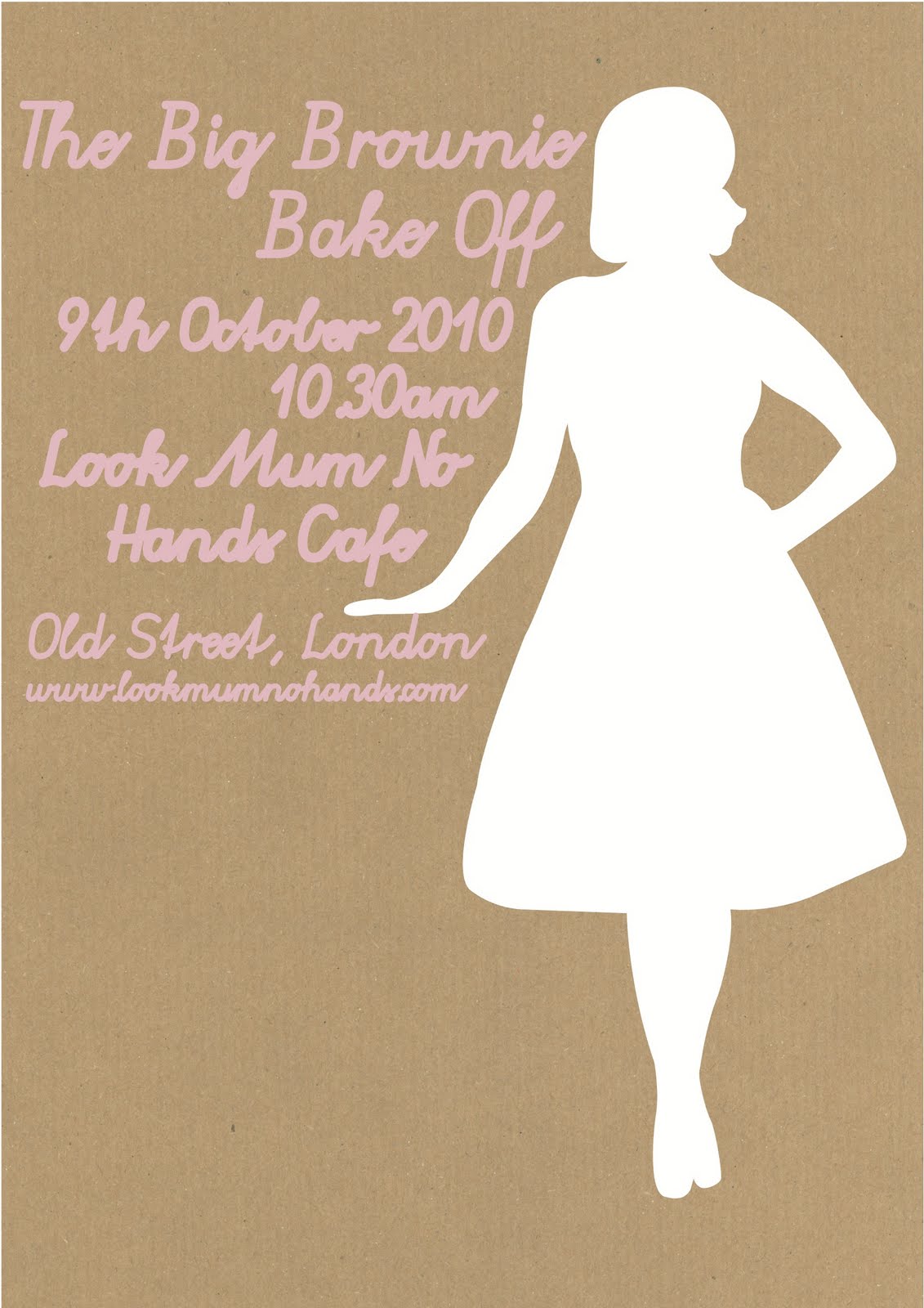
These are a selection of photographs of my research, ideas and development for a brief I'm working on at the moment for the Big Brownie Bake Off, an event that was held on the 9th October at the Look Mum No Hands Cafe in London's Old Street. Although this event has passed my work is for a screenprinting project I'm doing and this event is a perfect opportunity to do some really iconic imagery in a contemporary way. At this stage all of my development has been put together from a combination of hand done elements and for the purpose of developing my designs fully on-screen elements such as layout and type placement. When I have fully developed my concept and settled upon a final design I will be constructing it by hand ready for the screenprinting process, so all illustration and typography will be hand rendered and the layout measured by hand. I can't wait to get in the print room!
These photographs show the creative process I went through to create my initial ideas for 'The Big Brownie Bake Off'. The two photographs above show how I work, I like it messy with plenty of wall space to pin things up which is why I sometimes struggle to find enough space to work in the studio at Uni (without elbowing someone in the face or accidentally pinning their scarf to the wall). I always prefer to go out and about for inspiration and the photograph of my research show I got a bit snap happy whilst out looking for awesome posters to analyse (thats only two pages out of about 6, I found a lot of awesome posters). I am of the belief that there is no set way to work as a designer, its all about finding your groove, I have tried in the past to work the way a lot of other designers do, a layout pad and a fine liner in tow, but I never really feel I can express my creative brainwaves properly, drawing little boxes and putting a design into it, I infinitely prefer using a whole page as my box and filling it with a concept, annotating as I go really helps me to analyse and evaluate a concept even at this stage. I know I will evolve as a designer but working this way really helps facilitate the creative process for me and hopefully will continue to do so. I have used screen printing before but I have never experimented with open screen printing, I was fascinated with the possibilities in colour and texture that can be achieved using this technique, I included it in my developmental work to show the processes I had experimented with but it wasn't practical to use it for my final development, this is not to say I won't be using in a future project as I loved the outcome of just a few experiments.

Hello there! I have been neglectful of late with regards to my lovely blog but as the poster above shows I'M BACK! So get ready for another year of work, clever stuff (probably that I have collected but you never know, it might have even come out of my own brain!) and some random but usually funny stuff as well. In a bit my lovelies :)