08/12/2010

1st Double Page Spread Development


These screenshots show the development of the first of my double page spreads for the 5-a-day project I have been working on. I really wanted to carry on the theme from the cover onto this spread and use a different concept for the second DPS advertisement to create a definition for the issue and differentiate between a legitimate article and an advert. This concept was to be kept as simple as possible with a simple three column layout maintained to mirror the simple layout of the magazine I am using as a sample for this entire project. The typographic treatment needed to be simple and easy to read for both adults and children, I therefor chose a sans serif typeface and paid particular attention to the colour choice. Here these screen shots show the the different colours I tried whilst developing the layout of this piece. I wanted to try and stay with a primary colour as this has been proven to help children maintain maximum retention when reading (or so I have been told by a teacher friend).


06/12/2010

Cover Development


These screen shots show a selection of my development work for the cover development for the 5 a day brief I am working on at the moment. Once I got over the hurdle of producing the imagery for this concept it allowed me to move onto my favourite part of editorial design, creating my layout and finally seeing my work come together on screen. I did a lot of variations before I decided on the final layout, but I wanted to stick to the format of the original publication as much as possible so I chose a three column structure but using a modular basis for the article titles to encompass the main feature of the design (the food issue) to draw the eye to the magazine issues main focus. I think I achieved this successfully and i was really happy with the final design.

04/12/2010

Publication Research


This is a collection of images I found whilst researching the publication I am going to be using as the basis for my cover design and two DPS. I was attracted to this parenting magazine in particular due their style of layout using clean lines, two and three column structures and a lot of white space synonymous with my concept. I also really liked there heavy use of photography which works well with what I am trying to achieve in my own designs. I have used tis research to form the basis of my layout development as I take my designs into the final stage of composition.

Photography for cover and 1st DPS


This is a selection of photographs from the 81 photographs I took to try and get the the best imagery I could for my cover concept and DPS. I got there in the end and finally I began to crack on and get the editorial ball rolling.

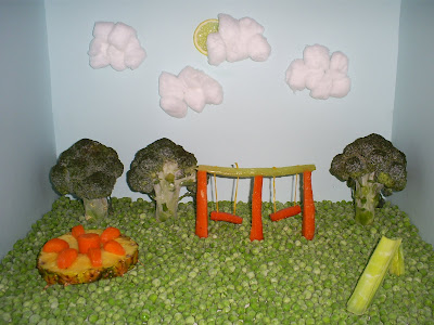
Fruit and Veg playground!


This is the realisation of one of my ideas. For my second DPS/advertisement I wanted to create an infographic with facts about fruit and veg, I really wanted to make this appealing to children aesthetically so that it could be used as a learning tool for parents to teach their children about the benefits of eating their five a day in a fun way. This idea model would be the basis of that concept. I had so much fun making this model and I was really happy with the final outcome, the photography is not to the highest standard as I had to shoot this at home with my digital camera (usually reserved for funsies as its not exactly a professional camera). This was due to the adverse weather we are having at the moment as I had to cancel two photo shoots with all the equipment I would need as I couldn't get there what with the lack of transport.
However I think that the photography still works and demonstrates what I am trying to achieve. I am looking forward to applying this photography to my DPS and developing the concept from there.

Realising a concept in fruit and veg - then realising the concept is a bit rubbish. Sad Face.


Firstly I have included some secondary research I did into making type out of objects, this is what i used to steer me in what I thought was the right direction with this concept.
This was my first endeavor in realising one of my concepts. After spending a wopping 26 english pounds on fruit and veg for this and another concept (and lets face it eating most of it) I started constructing the title of the project using my dining table as the work surface (much to my flatmates irritation). I realised shortly after this experiment that this concept just really wasn't working and went back to my ideas for inspiration as to what to do next.