27/11/2010

5?


I have been given a short brief based around the number five. The focus of this short brief was to get my creative process back into focus, from the very creative beginning. A lot of the time as designers we focus too much on the final outcome and not enough on the creative process so this brief was about reminding me where I began as a designer, and unsurprisingly it was at the beginning with a few clean sheets of paper and a pencil.
The brief was to create visual representations of the number 5. This is my collection of visuals stemming from my original mind map of EVERYTHING to do with the number 5. Wikipedia is obviously my best friend.

18/11/2010

Final Stationary Set - Sir Patrick Moore Personal Branding

One Day Brief - Sir Patrick Moore Personal Branding - Ideas and Development


We were given a one day brief to produce a business card, compliment slip and letterhead design for mock up to present to a 'client'. We were to conduct research on the client and come up with ideas, then develop an idea for presentation.
My client was Sir Patrick Moore. Luckily I knew exactly who Sir Moore was (after a quick google search to refresh my memory!) Initially I was a little 'WHAT!' but after two minutes I was totally up for it. I started off going through my collection of business cards I love, some of them are above on a mood board. (I love mood boards, they just get your synapsis popping) I then did a written mind map of iconic imagery associated with Patrick Moore and cracked on with getting some concepts down on paper. I then showed my concepts to my peers, explaining the thinking behind them and they pointed me in the direction of a couple that they thought, and I agreed, where the strongest. I then took those ideas straight into Illustrator and InDesign. I experimented with placement, layout, illustration styles, colour and format.
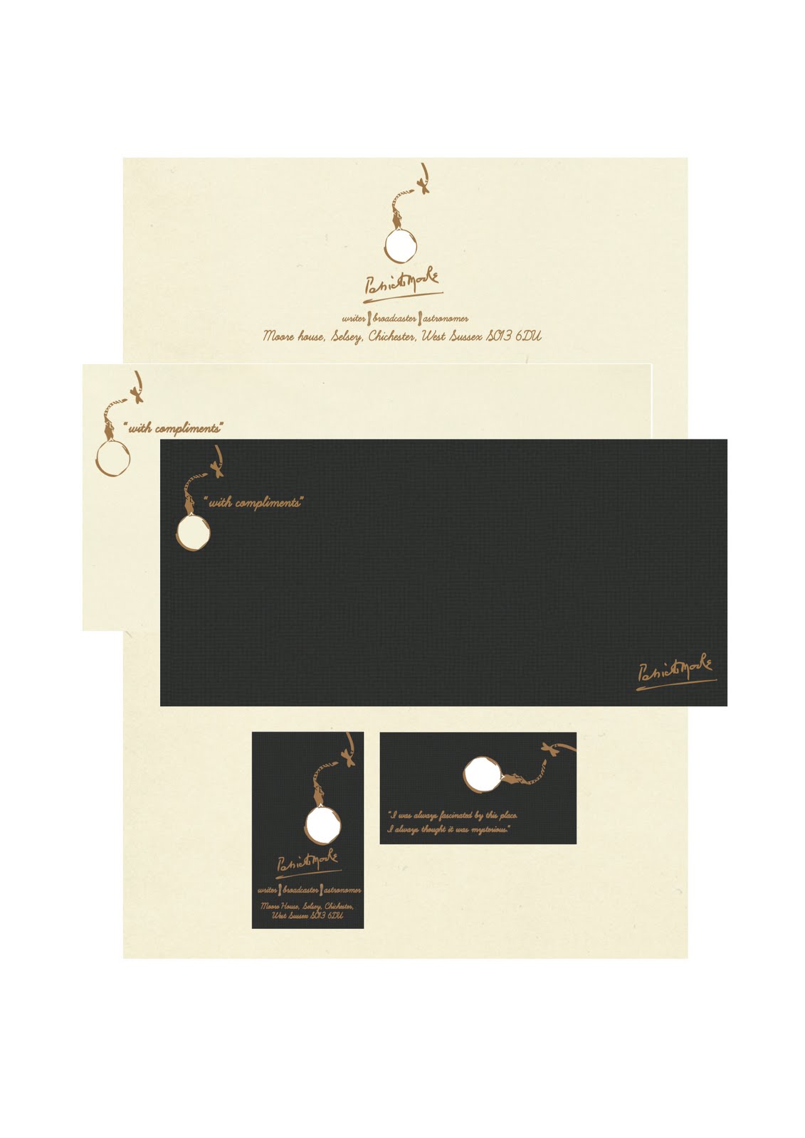
I really wanted to infuse contemporary elements with more traditional ones for this brief, I really felt that the use of a die-cut along side traditional typography using a heavy stocked textured card (business card and compliment slip) or hand made writing paper (letter head). I felt the best way to accomplish this (and to identify the most obvious imagery associated with Sir Moore) was to use an illustration of a monocle but die-cutting the monocle to make the business cards more interactive, and perfect for looking through to the 'sky at night' and in particular the moon, Sir Moore's first love in astronomy. This concept then lent itself perfectly to a quote from Sir Moore which I thought incredibly apt 'I was always fascinated by this place, I always thought it mysterious'. The monocle illustration alone wasn't enough me as a logo, I wanted to use his name but in a way that was apt to the concept and style I was working with. This was found in the form of his signature which I snaffled from his website, (I pentooled it to make it editable) I instantly loved the effect and how it sat with my over all concept.
Colour wise I wanted to convey luxury and tradition, I found this in the form of some beautiful hand made papers and card and my trusty metallic pantone colour book. I was really happy with the results and felt they quite aptly represented Sir Moore's personality.
I really enjoyed the reality injected into this brief, it was so refreshing to focus on the creative process in real time, talking about my ideas and the very quick thought process it requires was like a creative work out for my brain. I think this sort of brief should be a regular undertaking to mentally prepare us for what is to come and to keep us sharp.

Mounted Finally (yark, I said mounted).


This is my final collection of designs for the event 'The Big Brownie Bake Off'. A digital poster, a screen printed poster, ticket design, event information booklet, ticket pouch, event branded medium and large brownie bags, brownie box and apron design. I am really happy with the direction my work took and if I had been given longer to develop my event designs further I would love to have taken them away from print on to screen in the form of a micro site, website and web banner, with even the possibility of a sting or integrated an animation into the website/micro site. But as it stands I really like the outcome and think this whole body of work will sit well in my portfolio. I really enjoyed this project and how it was run like a real client would approach and deal with a design team or individual. We were tasked with original design problem which formed the basis of the entire project but as we went along the 'client' (our lecturer Roger) threw new extensions at us like a client could making us think bigger and really allowing us the take our concept further. One thing that really stood out to me during this project and something I have noticed over the past couple of years which I really think deserves mentioning is the major development of environmentally conscious design not being so much as a special attention to detail anymore but common practise, something we all think about when producing concepts; how would this be made, what materials could we use, could they be re-used in an interesting way. I think what started out out as an aesthetic movement (the hand made, hand rendered, back to basic movement) has finally seeped into our conscious working minds and we are really beginning to think about not only what our designs will do to and for our audiences but also our responsibility to sustainability in the design industry.
I think this is fantastic news, if student designers are thinking this way it can only be good news for the industry and ultimately the environment. (Oh hello soap box, its been a while.)

Screen Printing - good or evil?


Going to print was somewhat of a nightmare for us, there were a few technical difficulties such as defective emulsion to coat the screens (we found that out the hard way, after 3 hours of work and waiting), a few blew fuses on the UV exposure box, and wet wet feet. But we got there in the end! Despite all the speed bumps or what felt like kicks in the face, it was a lot of fun and amazing to see my designs printed in the medium. I had to experiment with how I was going to complete my design, the solid lady shape that was to be printed onto had to have time spend on it to find the best solution. I tried a stencil first using ink/paint and a roller, then a paint brush but both these methods weren't what i wanted in texture and colour. I then took the negative stencil and used that for my first screen print experimentation and it really worked. I was relieved and rather chuffed at the effect, clean and really represents the concept I wanted to achieve. My design survived the screen print test, much to my relief, without loosing any legibility and detail which was a major aim of the brief. As a technique I can see why it is making a come back for low budget replicas of posters (you can get ten prints out of a single screen before it has be wiped and re-emulsioned) and if you have access to the facilities take advantage, its an effect that can not easily be replicated on screen but be aware although its great for printing off a design in a variety colours with the most fantastic tactile quality and relatively speaking it can be really cheap, what you will need is rather a lot of time and patience. If these two virtues are not your strong suit stick to the Epson and forgo the tactility, or you may kick something and really hurt your foot.

11/11/2010

Brief Extension 3 - Event Merchandise Ideas and Development


The third and final Brief Extension for 'The Big Brownie Bake Off' was to create an additional piece that would sit well within our already accomplished event collection (hand rendered poster, digital poster and ticket design). I decided to do designs for aprons that could be worn during the event and bought by attendants after the event, brownie boxes and large and medium brownie bags, all fully branded. I wanted to really solidify a definite brand for the event in the form of merchandise that was both practical as well as aesthetically intriguing for the guests. Cost and sustainability with relation to environmentally friendly responsible design were top of my list when thinking about these concepts and so I resolved to design the aprons with screen printing in mind and the bags and boxes with recycled materials that can be used cheaply and without any fuss. As you can see I used a variety of ideas and combinations of the imagery and typography already explored earlier in the project to try to complete the collection. My final decision after evaluating my designs will be posted soon. No muss, no fuss.

Brief Extension 2 - Ticket Design - Ideas and Development


For the second extension of the brief we were to design tickets for our chosen event. These were to be of a similar concept to our posters to create a sense of brand continuity and recognition from our target audience. As my designs above show I looked at two completely different ways of representing the event in ticket form and the different ways I looked at of laying them out using elements from work I had already completed for the event. What I really wanted to maintain was a sense of vintage kitch I had explored in my research previously and also a strong connection to my original poster concept. This, I decided after doing some on screen development work, was best represented in the old style cinema ticket concept seen in many different ways above. The cupcake shape concept was really fun but with regards to practical industry production would have been very expensive to mass produce. However, I felt that just the simple 'cinema' ticket design was not enough and felt that the event was very likely to want to give its attendees something a little bit different so I created the apron shape you see at the top of this post. This idea could also be used to house not only the tickets purchased but also an information booklet on the event, but more importantly could be a precious keepsake for the attendees of the event which is something I feel the 'client' could be really open to (obviously depending on the cost!) This idea is shown here in its early stages of development but I feel it could be a real possibility in the body of work I am producing.

Brief Extension 1 - Digital Poster


The first extension of the event designs brief was to create a digital version of our poster designs. This was to be done in any manner we saw fit - we could use our original concepts in a digital way, go back to one of our aborted designs ir create a brand new concept and produce it digitally. We were allowed to still use hand rendered elements that we already had but the basis for this brief extension was to show us the difference in printing costs and production. We were to approach this brief as if the client had loved our screen printed designs but wanted something that could be mass produced, using full CMYK, no use of live trace and in a maximum of three colours.
I really wanted to keep the same concept as I felt it could form part of my portfolio alongside my screen printed hand rendered version successfully, showing the possibilities of my design with regards to industry requirements. Instead of simply using the scanned in elements of my hand rendered designs I decided to tidy up the entire design my using digital type and pen tooled illustration. I really like the over all effect and i think the digital version is just as successful as the original screen printed design.
This brief extension showed me that as a designer I must be willing and ready at all times to change tac at the request of the client and to always remember to keep my designs as versatile as possible to get the best results no matter what is thrown at me.

getting my designs ready for screenprinting


This a selection of screen shots showing the development of my poster by hand ready for screen printing. I really enjoyed getting back to basics and creating everything by hand, especially the typography. It isn't very often one gets the time and opportunity to create hand rendered type and in this instance got to work on my illustration skills as well. I have created two final designs to be printed onto acetate ready for exposure onto a pretreated screen. This is because i want to experiment with how I am going to create my final print. The first is the apron and type in perfect placement without the iconic 1950's housewife shape as I feel there will be a possibility to take this piece in a more mixed media direction by creating the shape from another material and screen printing directly onto this and the background. I think this approach could wield the best results in giving the crisp lines I am trying to achieve, using this screen will also give me the opportunity to try a stencil for the shape, giving me more opportunity for colour experimentation. Second design (without the apron) could also be used as the base of my poster, screen printed onto a recycled brown paper background and then my apron illustration stencilled onto that. If I am given the opportunity to use two screens then I will definitely be trying both approaches, however if that is not possible i feel the first design will be the most successful in giving me both ample opportunity to experiment and also a clean final design.